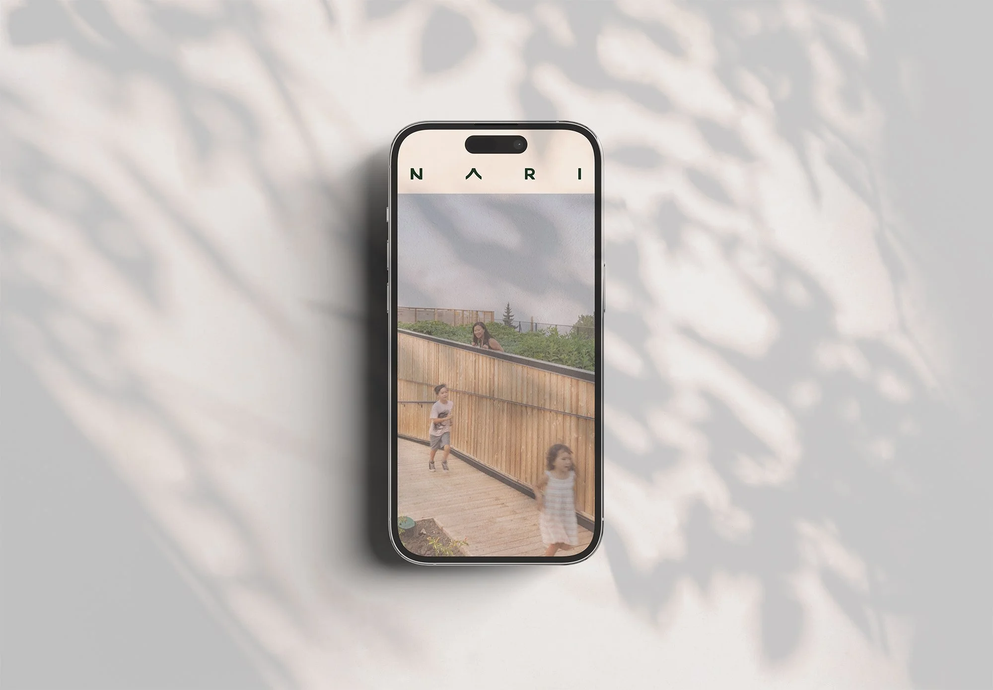
NARI
Nari is designed for a life well lived—enriching daily life with homes, shops, and spaces built for connection.
Nari is a calm and purposeful brand inspired by Japanese and Korean concepts of harmony and renewal. Its simple wordmark, natural palette, and airy design language reflect a community rooted in connection, balance, and the flow of everyday life.
NARI branding and visual identity framework is inspired by the philosophies of connection, purpose, and vitality. It reflects a vision where design goes beyond aesthetics, becoming a meaningful expression of community values and human experience.
Drawing from concepts like the Blue Zones, Zen Buddhist ensō, and ikigai, the brand envisions a community where all ages are celebrated and every stage of life has a place. Seniors are not only supported but deeply integrated into daily life, fostering intergenerational relationships and a sense of mutual respect.
In this framework, the building itself becomes more than a physical structure—it is a symbol of life’s continuity, harmony, and shared belonging. Every design element, from the signage to the interior details, is intentionally crafted to embody wellness, balance, and connection, creating an environment where individuals feel both inspired and at home.
Building Design Element
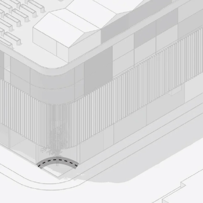
Japanese & Korean Traditional Roofs Angles

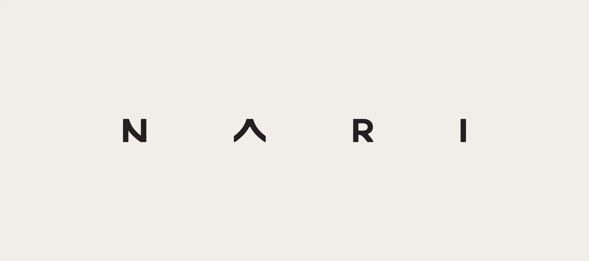
Wordmark
This wordmark proposal draws inspiration from the corner angles present in the building’s initial design concept, subtly reflecting the architectural lines that define its structure. It also echoes the sloping rooflines characteristic of traditional Korean and Japanese architecture, paying homage to their refined geometric forms. Additionally, the carefully considered spacing between the letters introduces a sense of calm, clarity, and balance, mirroring the harmonious principles found in both the Blue Zone concept and traditional Japanese and Korean architecture.
Brand Name
NARI
Na•ri (/na,ree/) Korea
Lily — A flower often associated with renewal, peace, and longevity.


Colour Palette
Similar Projects

Brewery Rail Lands
Aquila Pacific
Cover Art
Riverwalk